
7 Children's Book Cover Design Secrets That Make Parents and Kids Stop and Look
Children's book cover design has to pass two tests, not one. The adult holding your book decides whether it looks worth paying for, and the child decides whether they want it. A cover that wins one while losing the other stalls at the shelf. The 7 secrets below settle both.
You've finished the manuscript, or you're close, and now someone is asking what you want on the cover. It's a harder question than it looks. You know your story better than anyone. You still have no idea what a browsing parent needs to see in the half second they give it.
That gap is normal. Writing a children's book and judging a children's book cover are different skills, and finishing one doesn't prepare you for the other.
Children's book cover design is also the one part of your book that has to work on people who haven't read a word of it. Your writing gets judged after someone opens the book. Your cover gets judged before that, by an adult deciding in seconds and a child deciding faster.
So this isn't a guide to making a cover. It's a guide to judging one, and to briefing the person who builds it. By the end you should be able to look at a draft and say what's working, what isn't, and why. Your designer can act on that.
Two People Have to Say Yes
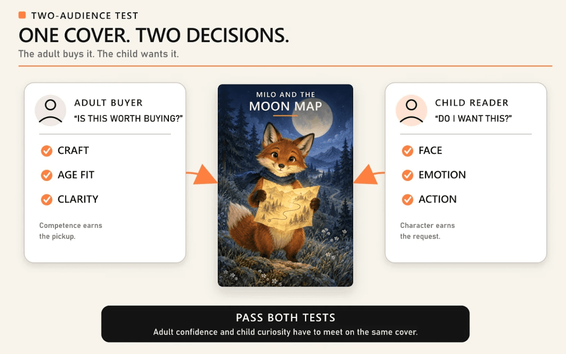
Your cover gets judged twice, by two people who want different things. The adult holds your book and asks whether it looks worth paying for, while the child looks at the same picture and asks whether they want it.
Those aren't the same question, and your cover can pass one while failing the other.
That's what makes a children's cover harder than an adult one. On an adult title, your buyer and your reader are the same person, so one judgment settles it. On a children's title, both decisions sit in two different heads at once, so your cover has to satisfy both.
Most cover advice ignores that split and writes to one undefined reader, which is why it contradicts itself. Keep it clean is adult advice. Make it bright and character led is child advice.
Both are right. What makes a good children's book cover depends on which of the two you're serving in a given decision, and knowing that keeps your brief coherent.
The 7 secrets below follow the order your buyer moves through. What stops the adult, what pulls the child, whose age your character should look, and how your cover gets built. Then why your title fails, what your back and spine carry, and what holds your series together.
Shelf or Screen, What Stops a Parent?
An adult stops for a cover that reads as competent, and that judgment lands before a single word gets read. That's true in both places your book gets met.
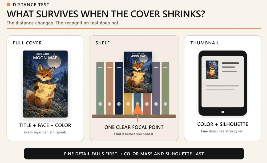
Face out on a shelf, your cover competes from several feet away, next to dozens of others, while on a retailer page it's the size of a postage stamp. The distance changes. The test doesn't.
The adult is reading craft, not taste, checking whether your art, your type, and your spacing came from one set of decisions. Here's what registers in that first pass.
- One clear focal point. The eye lands on purpose, instead of hunting across your cover for the subject.
- Type that belongs to the art. Your title looks commissioned alongside the illustration, not dropped on top afterward.
- Controlled color. A limited palette reads as designed. Every color at once reads as a first attempt.
- Room at the edges. Space around your title, and your character, says the layout was planned, not squeezed.
- An age the adult can place. Adults want to know, within a second, whether your book suits the child they're buying for.
The Half Second Before the Title
Image, color mass, and focal clarity all register before your title gets read, and that order holds at shelf distance and at thumbnail size alike. It's the words that go first.
So an adult forms an impression of your book from shape and color while your title is still a gray smudge. Your cover's first job isn't verbal.
If your art and your color don't say picture book, or funny, or bedtime, your title won't rescue them. By the time a parent is close enough to read words, they've already decided whether to pick your book up.
Why Clutter Reads as Amateur
A cluttered children's cover underperforms because competing focal points make the adult work, and work at that moment reads as amateur. Three characters, a landscape, a floating object, and a border all compete at once. The eye stalls.
An adult who has to hunt for your subject assumes nobody decided what it was. Clutter also costs you more on a shelf than on a screen. A shelf puts dozens of covers in view at once, so a parent compares yours in one glance.
Your cover loses that comparison to a calmer one, even when your drawings are better, and that's the most common reason a well illustrated children's book still looks homemade.
What a Child Reaches For
A child reaches for a face. Where the adult judges competence, the child looks for someone on your cover to be interested in. That makes child appeal character driven rather than composition driven.
Both tests run on the same picture, at the same moment. The judgment above is the adult half, and this one's the other half.
Children respond to expression, gaze, and warmth long before they process layout, so a cover with a strong character can be simple, even sparse, and still get picked up. A composed landscape with nobody in it usually doesn't, unless your book is about a place.
- A face with a clear emotion. Curiosity, mischief, and worry read instantly, while a neutral expression gives a child nothing to hold onto.
- Somebody about their own size. Children scan for a figure they can imagine being, which is the read up principle below.
- Warmth in the color. Warm, saturated color feels approachable to a young child. Cool, muted color doesn't.
- Something happening. Your character caught mid action tells a child there's a story here, before anyone reads a word.
Faces, Eyes, and Eye Contact
A character looking out of your cover pulls harder than one looking away, because direct gaze creates the sense of being addressed, and a young child reads that as an invitation. It's cheap to specify, and easy to forget.
Gaze pointed inward has its own use. A character looking at something in the scene sends the child's eye there too, which works when that object matters. What rarely works is a character looking out of frame at nothing.
That pushes attention off your cover entirely. The rendering style behind the face is a separate decision, and this site covers the full range of children's book illustration styles elsewhere. Settle the expression in your brief, and the style with your illustrator.
One Character Beats a Crowd
One character beats an ensemble on most children's covers. A single figure gives a child one clear person to want to be, a crowd splits that attachment, and it costs you the focal clarity the adult is scanning for.
So an ensemble cover tends to lose both tests at once. Ensembles earn their place when the group is the premise, a classroom, a family, a band of animals who need each other.
Even then, your cover needs one figure pushed forward so the eye has somewhere to land. Holding that character consistent between your cover and your interior pages is the job of the children's book illustrator who draws them. A mismatch makes a finished book feel assembled from parts.
Kids Read Up, So Design Up
Your cover character should look slightly older than the child you're selling to. Children read up. They aim at the age just above their own, so a cover mirroring a child's exact age can read as babyish.
That's where a lot of briefs go wrong. The common instruction is to match your character to your reader's age, and it's one step off. Match your content to that age, then aim your character just above it.
That gap makes your book feel like a step forward. How far above depends on your format, which your reader's age band sets. Children's publishing uses four recognized bands. Board books run 0 to 3, picture books 3 to 8, early readers 5 to 8, and middle grade 8 to 12.
Those bands overlap, and the edges are genuinely disputed. Early reader is given as 4 to 8 in some places and 5 to 8 in others, and middle grade stops at 12 in most sources and at 13 in one.
Picture books at 3 to 8 and early readers at 5 to 8 describe much of the same child. A 6 year old sits in two bands at once, so the age alone tells a parent almost nothing. Only your cover says which kind of book this is.
That format decision, picture book against early reader against educational title, gets settled at the children's book publication services stage, before cover work starts.
The Character Should Be Slightly Older
Slightly older means about a year or two above your reader, not a different life stage for your character. That gap is big enough to feel aspirational, and small enough to stay recognizable.
A picture book aimed at a preschooler works with a cover character who reads as a young school child, and stops working with a teenage one, because the child no longer sees a version of themselves.
The gap fails in the other direction too. Push too far, and the adult starts questioning whether your book suits the child they came in for. That fails the first test entirely, so it's worth stating outright in your brief.
Where Middle Grade Changes the Rules
Middle grade is where the child becomes the buyer, and that changes what your cover has to do. A middle grade reader browses alone, picks the book up themselves, and often asks for it by sight. So the adult approval test weakens, and child appeal becomes almost the whole decision.
Your cover moves away from cuteness, and toward atmosphere, mood, and a hint of stakes. Faces get less literal, sometimes disappearing behind a silhouette or an object.
What stays constant is the need for one clear idea. A middle grade reader scanning a shelf is doing what the adult was doing two bands earlier, just with different taste.
Five Cover Types and What Each Does
Children's book cover ideas fall into five recognizable builds, and choosing between them is the first real decision in your brief. The five are character led, scene led, single object or symbol, typographic, and series branded.
Naming the one you want saves a round of revisions, because the alternative is describing a feeling and hoping it's read the way you meant it. These are construction choices, not art styles.
Any of the five works in any visual language, so your type describes what your cover is made of, not how it's drawn. Each is good at something, and each gives something up.
Character Led Covers Put Someone Forward
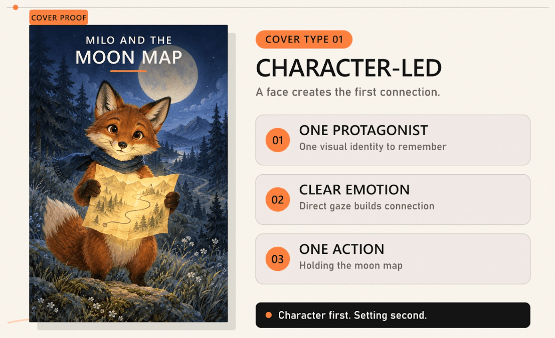
A character led cover puts one figure in front of everything else, and that figure carries the whole promise of your book. It suits any story where a child will attach to a person or an animal, which is most picture books and most early readers.
What it gives up is scope. One figure can't show a world, so a story whose appeal is a place, a journey, or an ensemble loses something here. It fails when your character is generic enough to belong to any other book, which happens far more often than authors expect.
To brief it, your designer needs the character's fixed features, the one expression that carries your story, and whether that character appears again in a later book. If interior art exists, they'll need it, because the cover figure and the interior figure must read as the same individual.
Scene Led Covers Show the World
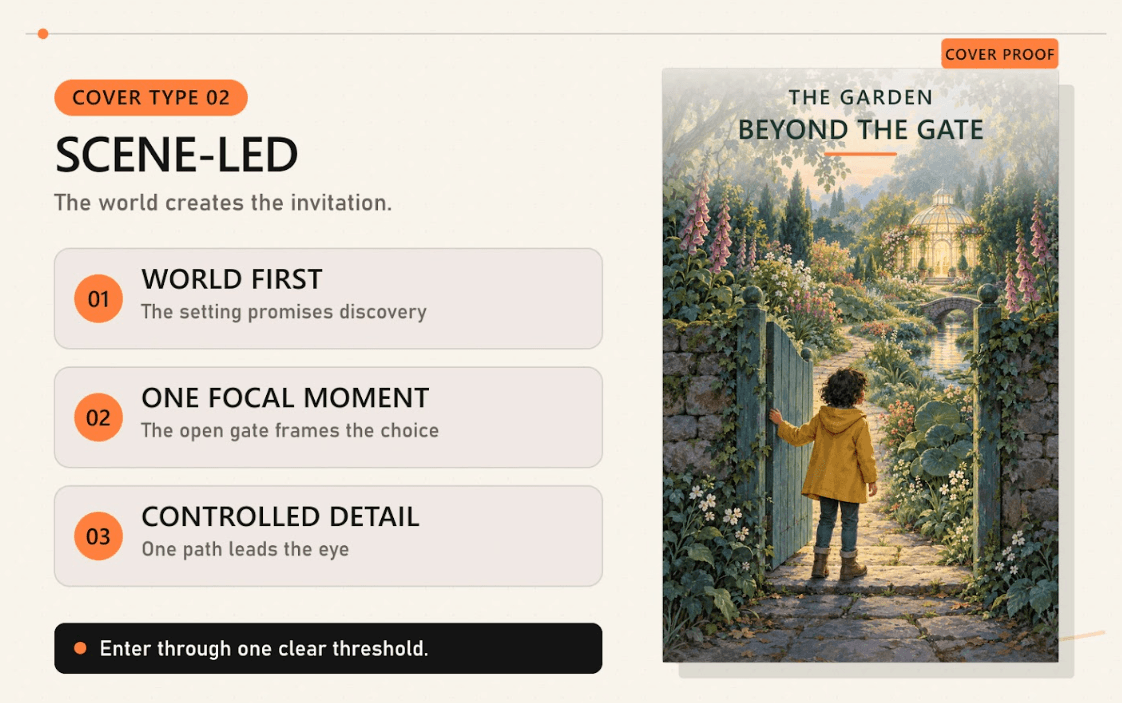
A scene led cover shows a moment or a place rather than a person. It earns its keep when your world is the selling point. Books built on a place, a journey, or a spectacle need the cover to show scale, and one figure against a plain ground can't do that.
What it gives up is focal clarity, and that's the thing the adult is scanning for. A scene has to be simplified well past what looks right at full size, or it becomes noise at browsing distance. Picture book cover design lands on character led far more often, since character is what your reader shops for.
So choose it deliberately, not by default. To brief it, your designer needs the single moment the cover stands in for, and they also need what a reader should understand about the world from it. The usual middle ground is your character, placed inside just enough scene to imply the world.
Single Object Covers Ask a Question
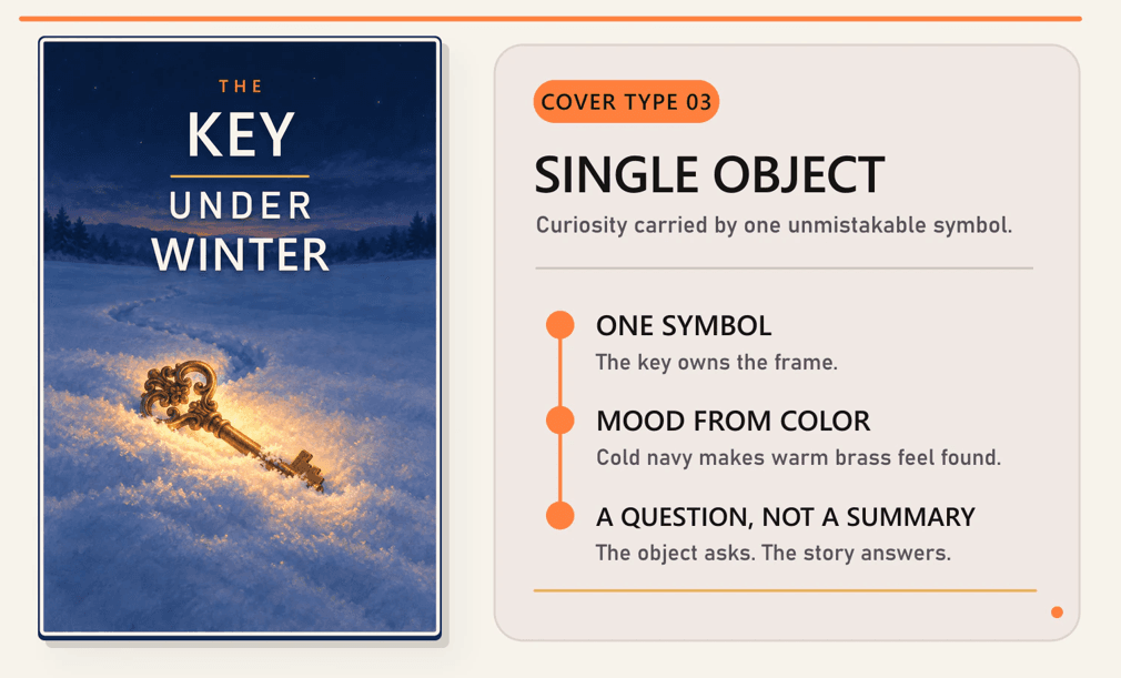
A single object cover puts one thing on the page. A key, a door, a pair of boots, and a reader left wondering what it's for. It's the most distinctive build on a crowded shelf, because almost every other children's cover carries a face.
What it gives up is warmth. An object doesn't smile, so the emotional read has to come from color and composition, and that's a harder brief to write. It fails with young children, who want a who before they want a what, and again when the object is too ordinary to be curious about.
To brief it, your designer needs the object, the reason it matters in your story, and the one feeling a reader should have looking at it. Objects work best on middle grade and concept books, where a reader will accept a puzzle instead of a person.
Typographic Covers Let the Title Lead
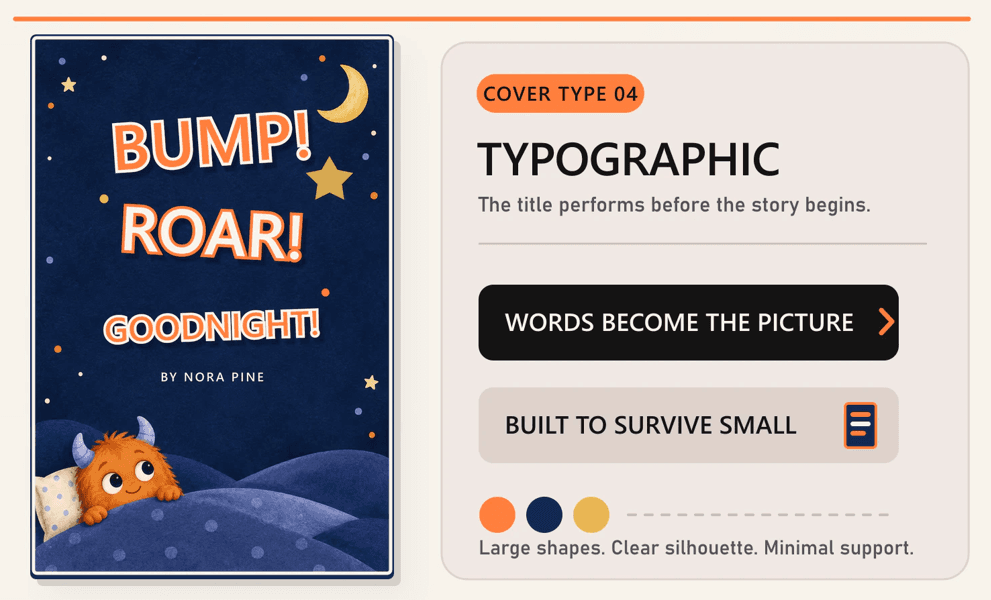
A typographic cover makes the words the picture, and it's right for a narrow set of children's books. Concept titles, joke titles, and books where the title is the premise. If your words are funnier than any picture of them, letting type carry your cover is a real choice.
What it gives up is the pull of a face, which is most of what a child responds to. It's also the type most often briefed wrong for your young readers. A child who can't read yet gets nothing from a cover made of words. So it works in two cases only.
Either the buying adult is the whole audience, or the lettering is drawn as an image in its own right. Decorative lettering that's really illustration isn't a title set in a playful font, and confusing the two produces a cover your reader ignores. To brief it, your designer needs the title in final form.
Series Branded Covers Share a Frame
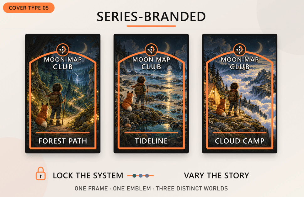
A series branded cover is a system rather than one image, so every book in your line shares a structural element. That element can be a title treatment, a band of color, a border, or a fixed position for the character on every cover.
It suits any book you're planning more of, and it's worth settling before the first cover goes to art. What it gives up is freedom on each individual cover, because every volume has to wear the shared system whether its story suits it or not.
It fails when the frame outshouts the story it frames, which happens when the system gets built before anyone knows what the later books are about. To brief it, your designer needs how many books you're planning. Then what changes between them, and how far the later volumes might drift in tone from the first.
What the Physical Format Changes
The physical object carrying your cover changes what that cover has to survive, though it doesn't change how the cover is composed. A board book gets chewed, dropped, and wiped clean, so its cover lives with rounded corners and thick stock that eat into the usable area.
A jacketed hardcover has flaps that need their own copy, and a case underneath that shows every time the jacket comes off. A printed case hardcover has no jacket, so the cover art is the object. A paperback bends, and scuffs first at the corners.
None of that decides which format your book should be, since that's a publishing decision made well before your brief exists. It's your format that your designer needs to know on day one. A cover laid out for a paperback, then moved onto a board book, loses the outside of itself.
Playful Fonts Fail at Small Sizes
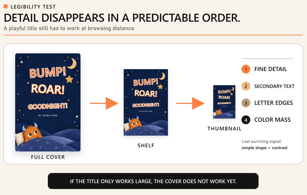
Children's titles break at small sizes more often than adult titles do, because the conventions of the category push in exactly the wrong direction. They run long. Yours probably does too.
They lean playful, decorative, bouncing, outlined, and shadowed, and each of those choices costs legibility. Then your cover gets met as a thumbnail on a screen, or from several feet away across a store.
Those are the same physics, a small angular size, and they break a decorative title the same way. The result looks charming on your designer's screen and turns into a shape at the size anyone meets it. What degrades, and in what order, is predictable.
- Thin strokes. The lightest parts of a letter go first, so outlined and hairline treatments lose their edges soonest.
- Tight letter spacing. Letters that nearly touch at full size merge into one mass, and your title stops reading as words.
- Low contrast against art. A title sitting on busy illustration loses its boundary long before it loses its shape.
- Subtitles and author names. Secondary text is already smaller, so it's gone while your main title is still hanging on.
- Decorative flourishes. Swashes, drop shadows, and texture read as dirt rather than detail, once your cover gets small.
The Title Is the First Casualty
Your title stops working before your art does. As a cover shrinks on a screen, or recedes across a room, the sequence is consistent. Fine detail goes first, then secondary text, then the letterforms of the title, and last of all the color mass.
That order is why color, and silhouette, are doing more selling than most authors expect. It's also why a title only readable at full size is a real defect, not a matter of taste.
If your words vanish at the moment a parent is deciding whether to walk closer, your cover's lost its one chance to say what your book is.
Where Decorative Type Earns Its Place
Decorative lettering earns its place when the character in the letters is part of what your book is. A title drawn as wobbly icing on a baking story carries information a clean typeface wouldn't, and so does one carved into wood on a forest adventure.
In those cases the lettering is illustration, doing a job worth paying for. What matters is whether the decoration survives being small.
Hand drawn lettering, built from weight and simple shapes, holds up, while the same idea in thin lines and fine texture doesn't. Put this to your designer as a question, not an instruction, and they'll tell you which version still reads at browsing distance.
The Back Cover Sells the Parent
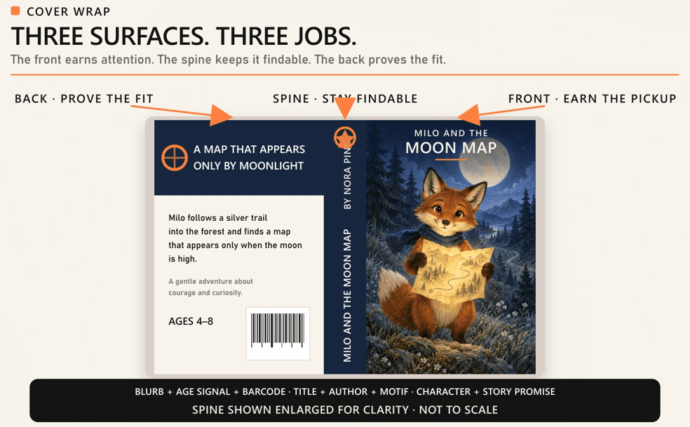
Your back cover is where the adult makes the actual decision. The front earns the pick up, the book gets turned over, and everything after happens on a surface most cover advice never mentions.
On a children's book, that surface carries more weight than on an adult title, because the person reading it isn't the person who'll read the book. Your spine matters for the opposite reason.
Once a book sits on a shelf, in a library or a store, the spine is the only part visible, and it has to hold up alone. Here's what those two surfaces have to carry.
- A blurb aimed at the adult. Short, specific, and clear about what happens and who your book is for.
- A reading level signal. The fastest way to answer the question your buyer is already asking.
- A visual link to the front. A character, a color, or a motif that makes the back read as the same book.
- Room for retail furniture. The barcode block, and publisher information, take real space, and a design that ignores them gets damaged later.
- A spine that survives alone. Title, author, and one element your reader recognizes, legible while the book sits shelved among hundreds.
The Blurb Is Written for Adults
Back cover copy on a children's book speaks to the buyer, not the reader. A picture book blurb would be pointless read aloud to a toddler, and it never is anyway. It's read standing up, by an adult deciding in a minute.
What that adult wants is fast. Who your story is about, what goes wrong, what the tone is, and whether it suits the child in their head. Charm helps.
Vagueness is what sinks a back cover, and lyrical copy that never says what happens is the most common version of it. Name the feeling your book leaves a child with, and you've done more than any adjective about the writing can.
What the Spine Has to Do Alone
The spine is your whole cover in most libraries, and across most of a bookstore, because face out display usually goes to new or featured titles. So for most of your book's life, the spine is the entire visible surface.
A child hunting for a book they were reading last month is looking at a strip of color, and very little survives at that width. A title set large enough to read from a step back, the author name, and one element the child recognizes.
Usually that's a color, or a character's face reduced to its simplest form. Series titles get the most out of this, because a matching spine turns a shelf into a set your reader can find at a glance.
Your Series Needs One Locked Element
Your series needs one element that never changes, so a child who loved the first book can find the next one without reading anything. That element is how recognition actually works at a shelf.
Children locate a series by sight, matching what's in front of them against a memory of a book. The match lands on a single strong feature rather than the overall look. Everything else can move, and usually should.
Decide what you lock, and what you leave free, once at the start, because if you change it at book 3 you'll lose every reader who was using it.
- Lock your character. The most reliable anchor, since the character is what a child remembers.
- Lock your title treatment. Same lettering, same position, same color, every time.
- Lock one color or shape. A band, a frame, or a background color that reads as the series.
- Vary the scene. New setting, new action, new supporting cast on every cover.
- Vary the palette within limits. Seasonal, or tonal, shifts are fine as long as your locked element still reads.
Lock the Element a Child Recognizes
Pick the anchor a child would describe, not the one a designer would. Asked to find a book they loved, a young child says the one with the red fox, or the one with the big yellow letters. They don't say the one with consistent typography.
Your anchor has to be nameable by someone who can't read yet. Once you've chosen it, hold it harder than feels necessary, because the temptation in book 2 is to improve it, and improving it is what breaks it.
If the fox gets a better design, a child holding a memory of the old fox no longer has a match. Your series loses the one thing it built.
What to Hand a Cover Designer
A cover brief for a children's book needs more than a synopsis and a title, and every decision above is part of it. An author who arrives with them settled gets a first draft that's close, not a guess. Prepare these, and you'll save a round.
1. The reader band and the format. Which age your book is for, and which format it'll be published in. Both change what your cover does.
2. The cover type you want. Character led, scene led, single object, typographic, or series branded, named in those words.
3. The character sheet. What your main character looks like, including the details that stay fixed.
4. The emotional register. Funny, gentle, adventurous, or reassuring, stated plainly. It's the piece most often left unsaid.
5. The title in final form. Your subtitle, and your author name, exactly as they'll appear, because a late title change changes the layout.
6. Back cover copy and the series plan. Your blurb, your reading level signal, and whether more books are coming.
Cost moves with scope. A single character on a plain ground sits at one end. A full scene with an ensemble, hand drawn lettering, and a locked series system sits at the other. Late changes to your title or format push cost up hardest, since both mean laying your cover out again.
Once your brief exists, hand it to the people who'll build your cover. Book Writing US takes children's cover projects from this point, and that's what our children's book cover design services are built around. We ask for your format, your reader band, and your cover type first, since those three answers shape everything after.
The brief is the one part we can't write for you. Tell us where your book is now, and we'll tell you what's still missing.
The Details Authors Forget to Send
The omissions that cause the most revision rounds are small, and boring. A subtitle that wasn't mentioned. An author name that should read differently from the legal name. A series plan that only surfaced after everyone approved the first cover.
None of these are creative decisions, and every one of them forces your designer to rebuild the layout. The other common gap is your emotional register, which authors leave unstated after sending plot, character notes, and comparison titles.
That's the single piece a designer can't infer from a synopsis, because a gentle bedtime story and a loud comic adventure can carry identical plot summaries. Say which one your book is.
Every one of these gaps costs less to close before cover work starts than after. If your brief still has holes in it, that's normal, and it's exactly what a first conversation is for. Bring what you have, even if that's only the manuscript and a reader band. We'll walk the remaining decisions with you, in order, before anyone opens a sketchbook.
Frequently Asked Questions
Should a children's book cover show a scene from the story?
Only if the scene is the selling point. A cover works better as a promise than as a summary, so a moment lifted straight from the book often carries less pull than an image built to introduce the character and the tone. Scenes suit books where the world or the setting is the draw. For most picture books, a character doing something is stronger than a faithful recreation of a page inside.
Does the main character need to appear on the cover?
Usually yes, because a child shopping for a book is shopping for someone to care about. A face gives them that instantly, and it makes the book recognizable later when they want it again. Exceptions exist for concept books, wordless books built on an object or an idea, and some middle grade titles that trade a face for atmosphere. If your book has a central character, put them where they can be seen.
Who designs the cover if my book already has an illustrator?
The interior illustrator often creates the cover art, since the character has to match what is inside the book. Cover design and cover illustration are still separate jobs. Someone has to handle composition, title treatment, back cover layout, and the spine, which is design work rather than drawing. On many children's projects the illustrator supplies the artwork and a designer assembles the finished cover around it.
When in the process should the cover be designed?
After the manuscript is final and the format is settled, and before marketing begins. The cover depends on decisions the text and the format make, including the title, the reader band, and whether the book is a board book or a paperback. Starting earlier means redesigning later. Starting too late leaves you nothing to show retailers, reviewers, or readers while interest is building.
Does a children's book cover need to match current trends?
No, and chasing them tends to backfire. A children's book stays in print and on shelves far longer than a trend lasts, so a cover tied tightly to this year's look will read as dated while the book is still selling. Trends are useful as a check that a cover does not look decades old. They are a poor reason to make any individual decision about your own.
What separates a children's cover designer from a general one?
Knowing that the cover answers to a child and an adult at the same time, and knowing which conventions carry meaning to each. A general book cover designer works for one reader. A children's book cover designer works for two. The specialist understands reader bands, read up appeal, how format changes what a cover must survive, and why a title that looks charming at full size fails at browsing distance.
- Two People Have to Say Yes
- Shelf or Screen, What Stops a Parent?
- What a Child Reaches For
- Kids Read Up, So Design Up
- Five Cover Types and What Each Does
- Playful Fonts Fail at Small Sizes
- The Back Cover Sells the Parent
- Your Series Needs One Locked Element
- What to Hand a Cover Designer
- Frequently Asked Questions