Publishing Mistakes That Make a Self-Published Children's Book Look Amateur
Short Answer: The self-publishing children's book mistakes that make a book look amateur are usually slips in how the book was made, not in your story. The big ones are a size picked too late, a hero who changes between pages, words on busy art and blurry pictures. Art that misses the edge, a cover you can't read when it's small, a skipped proof and a weak listing give a book away too. Most of them start early and only show up in print.
Maybe the first printed copy of your picture book has just arrived. You set it next to a library book your grandchild loves. Something about yours feels homemade, but you can't quite say what it is. The story is the one everyone praised, so the difference must lie somewhere else.
This guide covers the self-publishing children's book mistakes to avoid when you make and publish the book itself. For each one, you'll see why it happens and what a finished book does instead. That way you'll know what to check, and what to ask anyone who helps you. Writing the story is a separate subject, so you won't find tips on rhyme or plot here.
What Does a Self-Published Book Look Like to a Parent?
To a parent, your self-published book looks like any other book until something small feels off. A parent can't see how your book was published, only how it was made. What gives a book away is a handful of small production slips that add up. Think of fuzzy pictures, words that are hard to read, or a hero who changes from page to page. The table below pairs each slip with what a parent sees and the fix.
| The mistake | What a parent notices | What a finished book does instead |
|---|---|---|
| Size or page count picked after the art | Cropped pictures, or a book the wrong size for its reader | Size, binding and page count are settled before the first sketch |
| A main character who changes | A face, color or outfit that shifts from page to page | Every page is drawn against one character sheet |
| Words set on busy art | Lines a parent has to squint at while reading aloud | The art leaves quiet space for the words |
| Low resolution pictures | Soft, fuzzy or blocky art | The art is made at full print size from the start |
| Missing bleed, or words near the trim | Thin white slivers at the edge, or words that look cut close | The art runs past the trim, and the words stay inside the margin |
| A cover that vanishes when small | A title nobody can read on a phone | The cover is checked at thumbnail size before it's approved |
| No printed proof | Slips that only show on paper, such as art sinking into the fold | A proof copy is read page by page before the book goes on sale |
| A thin listing | A book shown to the wrong age group, in the wrong category | The description, categories and reading age match the book |
Most of these slips start with a decision made early. They only show up at the very end, on the proof or in a reader's hands. That's why the sections below follow the order your book is made, starting with its size.
How to Tell If a Book Is Self-Published by Looking at It
Most of the time, you can't tell from the pages alone whether a book is self-published. That's good news for you. A carefully made self-published picture book can sit beside titles from large publishers without standing out. Readers notice craft, not the route a book took to print. The real question is whether your book looks finished.
When a self-published book does give itself away, it's through the slips in the table above. You can catch every one of them before printing. So if you're worried people will spot your book as self-published, put that worry into checking your pages. There's nothing to be embarrassed about in the route itself, and a well-checked book gives readers nothing to wonder about.
Why Do Some Self-Published Books Look Unfinished?
Plenty of self-published books are lovely, and the ones that look unfinished usually weren't made carelessly. When a self-published children's book looks homemade, it's often because one person did four or five specialist jobs alone. Those jobs include art direction, page layout, preparing the print files and proofing. Nobody checked the work in between. The printing platform then prints exactly the file it's given, slips and all.
Picture books show these self-publishing problems more than novels do. Nearly every page carries art, and the words sit right on top of it. So a slip in one job lands in the middle of another. A novel can hide a plain layout behind a gripping story, but your picture book can't hide a blurry spread from a curious child.
Picture a dad who drew his daughter's story in the evenings. He set the pages in a free program at the kitchen table and uploaded the file himself. Each job was done with love, but nobody looked at the pages with fresh eyes in between. It's one of the classic self-publishing pitfalls, and it has nothing to do with talent.
The costliest mistakes follow a simple pattern. You make them early, when you choose the size or first draw your main character. They only show up late, on the proof or in print. By then every page has been built on that early choice, so a small decision becomes a big fix. Knowing how children's book publishing works, from manuscript to printed book helps, because it shows you which choices come first.
A Trim Size or Page Count That Doesn't Fit the Format
Choosing your trim size and page count after the art is drawn is one of the costliest picture book mistakes. The trim size is the finished size of each page, and every illustration is drawn to fit that one shape. If your book ends up a different shape, the art gets cropped or leaves empty bands. Some print formats won't take a short picture book at all. So if you already have finished art but no book size yet, check which sizes fit that art before you plan anything else.
This mistake happens because size feels like a printing detail you can leave until the end. Think of a retired teacher who had square spreads painted for her class story. Only then did she decide she wanted a hardcover on Amazon, and that format didn't fit her art. On Amazon KDP and IngramSpark, the format you pick also sets how many pages your book needs.
| Print choice | Page count it needs | Fits a short picture book? |
|---|---|---|
| Amazon KDP paperback, premium color | 24 pages or more | Yes |
| Amazon KDP paperback, standard color | 72 pages or more | No, it needs far more pages |
| Amazon KDP hardcover | 75 to 550 pages | No, a short picture book is too thin |
| IngramSpark hardcover | 18 pages or more | Yes |
KDP hardcovers also come in only a handful of sizes, and none of them is square. So a square picture book can't keep its shape as a KDP hardcover. A 32-page picture book can't become a KDP hardcover either, because it's well under the 75-page floor. IngramSpark's hardcovers start at 18 pages, so your short picture book can be a hardcover there.
Two smaller traps catch picture books at upload. Amazon KDP counts pages in even numbers and rounds an odd count up, which adds a page you didn't plan. IngramSpark keeps the last page of every book blank for its printing details. So if your story ends on the final page, plan room for one more page after it.
These look like book printing mistakes, but the printer only does what your file asks. The real slip happened much earlier, when the size was left open. A finished book settles the size, binding, page count and platform before the first sketch. That way the art is made for the book it will actually become.
A Main Character Who Changes From Page to Page
Parents and children do notice when your main character looks different from one page to the next. It's one of the quickest signs of an unfinished book. Children study pictures closely, so they'll spot a scarf that changes color, a missing freckle or a dog whose patch switches eyes. A parent reading aloud notices too, often because the child stops the story to point it out.
Characters drift for plain reasons. The pages may be drawn weeks apart with nothing fixed to draw from. More than one artist may work on the book, or an image tool may make each picture separately with nothing holding the look steady. A tiny change on each page adds up, so by page 12 a red scarf can quietly turn orange.
In a finished book, the character is fixed before any page art starts. A character sheet shows the hero from several angles, with set proportions, colors, clothes and a few key expressions. Every page is then drawn against it. At the end, the full set of pages is checked side by side before layout. That's when a drifted detail is still easy to fix.
Whoever draws your book, ask to see the character sheet before the page art begins. It's a fair request whether you hire a freelance artist or use children's book illustration services, and it saves you a lot of redrawing.
Words Set on Busy Art, or in a Hard-to-Read Font
Putting your story text on top of a busy illustration is a mistake that shows on the very first page. When words sit over a face or a pattern, a parent has to squint in the middle of reading aloud. A tiny or novelty font does the same thing. Text on art can work well. It just needs a calm patch in the picture, planned for your words.
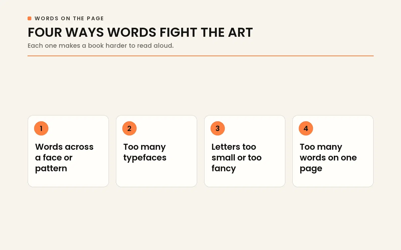
This happens when the art is finished before anyone decides where the words will go. The illustrator fills every corner, and the words get dropped in wherever they fit. Here are the signs that your words and art weren't planned together.
- Words sit across a face, a pattern or the busiest part of the picture.
- The book uses too many typefaces, sometimes a different one on each page.
- The letters are too small or too fancy to read aloud with ease.
- One page carries so many words that the picture gets squeezed.
Word count per page is really an editing question, and what a children's book editor checks before the words meet the art covers it.
Think of a parent reading a pirate story at bedtime, with thin white words laid across a stormy sea. Every wave shows through the letters, so the reading slows down just when the story should speed up.
The fix is to plan quiet space in the art for the words from the sketch stage onward. Typesetting then settles where your text goes, which font it's set in and how the words flow. Amazon KDP sets a minimum font size of 7 points. Its cover guide also warns that text too close in color to the background can blend in. Treat those rules as the floor, not the goal, because a size the printer accepts isn't always easy to read aloud.
Why Do Pictures Look Sharp on Screen but Blurry in Print?
Your pictures look sharp on a laptop but blurry in print when the files don't hold enough detail for their printed size. A screen shrinks a picture to fit the window, so a small file can still look crisp. A printed page is a fixed size. A file without enough detail gets stretched across it and comes out soft, fuzzy or blocky.
Resolution is the amount of detail an image holds. Once it's missing, you can't add it back. DPI, short for dots per inch, describes that detail for print. Amazon KDP explains that it isn't possible to add dots or pixels to an image. So typing a bigger DPI number into your file's settings won't make the picture any sharper.
Low resolution usually sneaks in by accident. Your art gets saved small to keep the files light, or a screenshot stands in for the original. Sometimes an illustrator friend sends the pages through a chat app that shrinks them on the way. Stretching a small image to fill a whole spread causes the same problem. KDP warns that enlarging an image after you've placed it lowers its resolution.
The only real fix is to make the art at full print size from the start, check the files before layout and keep the originals safe. If the originals are lost, the page has to be drawn again.
Art That Stops Short of the Edge, or Words Too Close to It
Your printed picture book comes back with thin white lines along the edges when the art stops exactly at the page edge. Every page is trimmed after printing, and the cut can shift slightly from copy to copy. So art that should reach the edge has to run past the cut. Words and faces have to sit well inside it.
That extra strip of art past the page's final edge is called bleed. Bleed means your picture still reaches the edge once the page is trimmed. Amazon KDP says it's what stops a white border from showing. The guide to how a print file becomes a trimmed, finished book follows the whole journey.
Words or faces placed too close to the edge are the second slip. The margin is the safe space just inside the page edge. KDP says margins keep your text from being cut off during printing. IngramSpark gives the same warning about anything outside its safety areas.
The third slip happens in the middle of a spread. The gutter is the inner edge of each page, where two facing pages meet at the binding. Anything you place there sinks into the fold. A grandchild's name printed across the center of a spread can end up half hidden, right where the book should feel most personal.
A finished book plans all three edges from the sketches onward. The art runs past the trim, and the words and faces stay inside the margin and away from the fold. Moving a character in a rough sketch is far easier than repainting a finished spread. That's why planning faces and words away from the fold at the storyboard stage saves you so much trouble.
A Cover That Disappears at Thumbnail Size
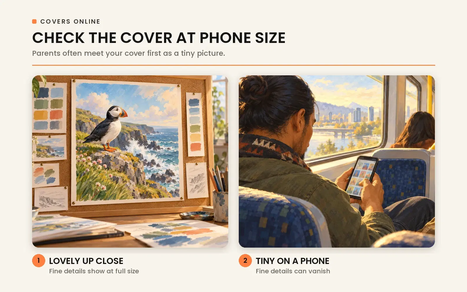
A cover can make a well-made picture book look amateur in two ways. It can blur into a colored shape as a small thumbnail online. Or it can break Amazon KDP's cover rules, like a title on the spine of a book too thin for spine text. On Amazon, a parent often meets your cover first as a tiny picture in search results.
The thumbnail problem happens when you only ever judge the cover full size on a big screen. Fine lettering, a pale title and a crowded scene can look lovely up close and then vanish when the cover shrinks. A finished cover gets checked small, at about the size a phone shows it, before anyone approves it.
The spine trap surprises many picture book authors. Amazon KDP only prints spine text on books with more than 79 pages. It rejects a cover with spine text when the book is under 79 pages. If your picture book is shorter than that, your front cover has to name the book on its own.
The back cover has its own trap. If you don't supply a barcode, Amazon KDP places one on your back cover. It also rejects covers with images or text in the barcode spot. KDP asks that anything you don't want trimmed off sit at least 0.25 inch from the cover's outside edge. So a dedication or a small drawing placed in that corner will have to move.
For the design side of a strong cover, see the cover design choices parents notice first.
Is a Printed Proof Really Worth Ordering?
Yes, a printed proof copy is worth ordering, even when every page looks fine on your screen. A proof copy is a single printed test copy of your book. It's the only way to see your picture book the way readers will hold it. Both Amazon KDP and IngramSpark recommend ordering a printed copy before your book goes on sale.
Amazon KDP gives you one more reason, because your ink and paper type are locked once the book is published. So the proof is your chance to confirm those choices while you can still change them. A proof also shows you things a screen can't. These are the ones worth a slow look.
- Art or words sinking into the fold in the middle of a spread.
- How near the trimmed edge your words and faces really sit.
- How the book feels in small hands, from its size to its weight.
- Where each page turn lands when you read the story aloud.
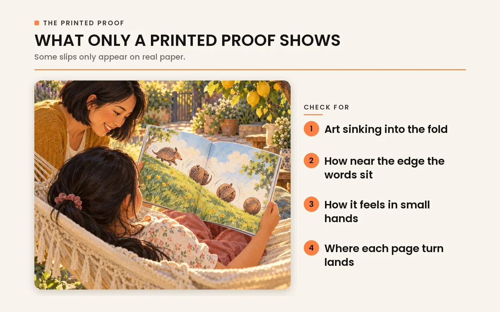
Picture a grandmother reading the proof aloud to her grandson. She realizes the big surprise shows up before the page turn instead of after it. At the proof stage that's a quick layout fix, but once copies are sold, it's part of the book for good.
A finished book treats the printed proof as the real test, read page by page before anyone approves the print files.
A Thin Book Description and the Wrong Categories
Your children's book can be beautifully made and still look amateur online. That happens when its book description is thin and its categories point to the wrong readers. The listing is often the first thing a buyer reads about your book, so it's part of the finished product. Amazon KDP lets you choose 3 categories and says it doesn't tolerate categories that mislead readers. Its content guidelines also don't allow descriptions that misrepresent what's inside.
What Should a Children's Book Description Say?
A children's book description is written for the adult who's buying. In a few plain sentences, it says what the story is about, who it's for and how it feels. It doesn't retell every page. So if you're writing the Amazon description for your grandson's picture book, imagine a parent deciding in seconds whether it's right for their child.
Amazon KDP's own advice suits children's books well. It suggests keeping your book description simple, compelling and professional, in a paragraph of about 150 words. It also advises a first sentence that draws readers in and a clear sense of what kind of book it is. And it asks you to check for spelling mistakes.
Three slips make a description look homemade. Some are written in the child character's voice, which confuses a parent who's scanning quickly. Others summarize the story page by page, which gives away the ending. The worst promise a different book, like a silly romp that turns out to be a quiet bedtime story, and that leaves your buyers disappointed.
When the Age on the Listing Doesn't Match the Book
When the age on your listing doesn't match what's inside, the wrong parents find the book and the right ones scroll straight past. Imagine a grandfather's picture book for 3 to 5 year olds that ends up listed for ages 9 to 12. The little ones who'd love it never see it, while the older readers who find it feel it's too young for them.
Amazon KDP lets you set a reading age for your book. It warns that a children's book with no suitable reading age may not qualify for the Children's categories you picked. It also won't show up in age-specific search results. For the ages each kind of book usually suits, see this guide to children's book categories and the ages they suit.
The listing isn't the only place the age has to match. Your trim size, page count, words per page and type size should all point to the same reader. A finished book settles the age once, early on, and every later choice follows it.
Where to Get Help Finishing Your Picture Book
If you'd rather not catch these mistakes alone, Book Writing US can help. We're a children's book publishing company, and we help authors take a finished manuscript all the way to a printed book. Our children book publishing services include editing, illustration, the page design and cover, printing and publishing. Picture books, early readers and educational books are all part of that work.
If your art is already done, you can bring it along, and if it isn't, our illustration service can draw it. Whichever route you choose, make sure the final decisions stay yours and the rights to the art are agreed in writing. If you'd like to talk about where your book stands, we'd be glad to hear from you.
Frequently Asked Questions
Why would Amazon KDP reject a children's book?
Amazon KDP most often rejects a children's book because of a file problem. Common reasons include pages that aren't sized properly and spine text on a book under 79 pages. A title missing from the front cover, or one that doesn't match the title you entered at setup, causes trouble too. So do images or text placed where KDP puts its barcode. Passing these checks only means your files meet KDP's requirements, so a book can still go live and look amateur.
What are the most common self-publishing mistakes?
Across all kinds of books, the usual self-publishing mistakes are a homemade-looking cover and pages laid out like a typed document. Skipping fresh eyes on the final pages and skipping the printed proof are common too. A picture book adds a set of its own, because the art carries half the story. That's where a size chosen too late, a character who drifts and words on busy art come in.
How can you tell a printing mistake from a mistake in your own files?
If the problem is in your file, every copy will show it. So check your file first. Amazon KDP says an issue that's also present in the manuscript, such as typos, streaks or blurry images, isn't treated as a manufacturing defect. Small shifts in the trim or cover position can differ between two copies of the same book, and KDP allows a small variance for them. So when one copy looks off but your file looks right, compare it with a second copy.
Can you design your own children's book cover?
Yes, you can design your own children's book cover, and Amazon KDP even offers a Cover Creator tool. The risks are the ones this guide covers. Your cover may not read well as a thumbnail, or the file may break the rules on bleed, spine text or the barcode spot. A homemade cover also sits next to professionally made covers in every search, so judge yours at thumbnail size before you call it finished.
What does "Independently published" mean on Amazon?
"Independently published" on an Amazon listing usually means the book uses a free ISBN from Amazon KDP. That's the imprint KDP shows for its free ISBNs. It's a sign a book was self-published, but not a sure one. A book with IngramSpark's free ISBN shows Indy Pub as its imprint instead. An author who buys their own ISBN can list their own imprint name. So the publisher line tells you whose ISBN a book uses, not how well it was made.
Why are self-published books so bad?
Most of them aren't, and plenty of self-published picture books are lovely. The ones that look unfinished usually had one person doing several specialist jobs alone, from the art to the print files, with nobody checking the pages in between. The fix is care in how the book is made, not a different way of publishing it.
- What Does a Self-Published Book Look Like to a Parent?
- Why Do Some Self-Published Books Look Unfinished?
- A Trim Size or Page Count That Doesn't Fit the Format
- A Main Character Who Changes From Page to Page
- Words Set on Busy Art, or in a Hard-to-Read Font
- Why Do Pictures Look Sharp on Screen but Blurry in Print?
- Art That Stops Short of the Edge, or Words Too Close to It
- A Cover That Disappears at Thumbnail Size
- Is a Printed Proof Really Worth Ordering?
- A Thin Book Description and the Wrong Categories
- Where to Get Help Finishing Your Picture Book
- Frequently Asked Questions